Hello to everybody!!
We started the day today with a review of some informatic tools by Elisa Pozo, architect and urban planner by Universidad Politécnica de Madrid. The interest of this overview is to help us to visualize the data we are using for analyse of health data and elements that configure the urban environment, such as air pollution values, radiation, or other kind of data applied for territories or open urban spaces.
There are several tools that offer us the possibility of visualising all kind of data, such as GIS or other public platforms as cartodb. In this context, we have introduced some methodologies to work with visual programming software and different tools that offer us the possibility to get data and how to visualize it as well as construct our own data and then work with it.
Some of the examples we have brought today have been natural drainage, air pollution visualisation, radiation and cast shadows analysis.
Elisa Pozo showing a small demo of how to build 3D models and data visualization.
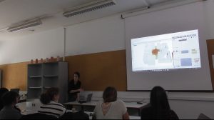
In the afternoon we have the presentation of the advances of the students. We had a review of all the analysis and information they are developing for the workshop and some feedback from our coordination team.
We continue our work for the final presentation on 8th April!
Next week we will have the experience of participatory processes and ageing!
See you next monday!
UNI-Health Team